Visualization of Volcano Plots in R
Introduction
A volcano plot is a type of scatter plot commonly used in biology research to represent changes in the expression of hundreds or thousands of genes between samples. It’s the graphical representation of a differental expression analysis, which can be done with tools like EdgeR or DESeq2. Volcano plots indicate the fold change (either positive or negative) in the x axis and a significance value (such as the p-value or the adjusted p-value, i.e. FDR) in the y axis. Points represent individual genes and can be labeled or colored according to some attribute, such as whether they are up- or down-regulated, a significance threshold, etc.
In this post I’ll go through a step-by-step simple tutorial for the visualization of volcano plots in R using tools from the tidyverse, such as dplyr, tidyr, and ggplot2. I assume the reader already knows the basics of R and has some familiarity with the tidyverse package.
R packages and data
In addition to the tidyverse package, I’ll load the ggrepel package to aid in the labeling of the genes. The example data comes from a research article and can be downloaded here.
Let’s load the packages and import the data:
# The packages can be installed within R with:
# intstall.packages(c("tidyverse", "ggrepel"))

# Load packages
library(tidyverse)
library(ggrepel)

# A short function for outputting the tables
knitr_table <- function(x) {
  x %>%
    knitr::kable(format = "html", digits = Inf,
                 format.args = list(big.mark = ",")) %>%
    kableExtra::kable_styling(font_size = 15)
}


# Import data
data <- read_tsv("https://raw.githubusercontent.com/sdgamboa/misc_datasets/master/L0_vs_L20.tsv")
dim(data)
## [1] 20945 4
head(data) %>%
 knitr_table()
| Genes | logFC | PValue | FDR |
|---|---|---|---|
| 276_4 | -10.511825 | 1.597352e-61 | 3.345653e-57 |
| 62_157 | -9.317522 | 6.982557e-54 | 7.312483e-50 |
| 144_7 | 12.203291 | 2.423896e-53 | 1.692283e-49 |
| 198_6 | -10.022519 | 3.310041e-53 | 1.733220e-49 |
| 829_3 | 11.867788 | 2.981901e-51 | 1.249119e-47 |
| 44_124 | -8.906832 | 2.981555e-50 | 1.040811e-46 |
The data contains four columns and 20,945 rows. Each row represents a gene. The column ‘Genes’ contains the sequence names of each gene. The ‘logFC’ column contains the logarithm base 2 (log2) of the fold change of each gene; up-regulated genes are positive, down-regulated genes are negative. The ‘PValue’ and ‘FDR’ columns contain the significance values; these must be converted to the negative of their logarithm base 10 before plotting, i.e -log10(p-value) or -log10(FDR). I’ll use the -log10(FDR) in this post.
A simple volcano plot
Since volacno plots are scatter plots, we can use geom_point() to generate one with ggplot2. The conversion of the FDR values to their -log10 can be done at this step:
p1 <- ggplot(data, aes(logFC, -log(FDR,10))) + # -log10 conversion
  geom_point(size = 2/5) +
  xlab(expression("log"[2]*"FC")) +
  ylab(expression("-log"[10]*"FDR"))
p1
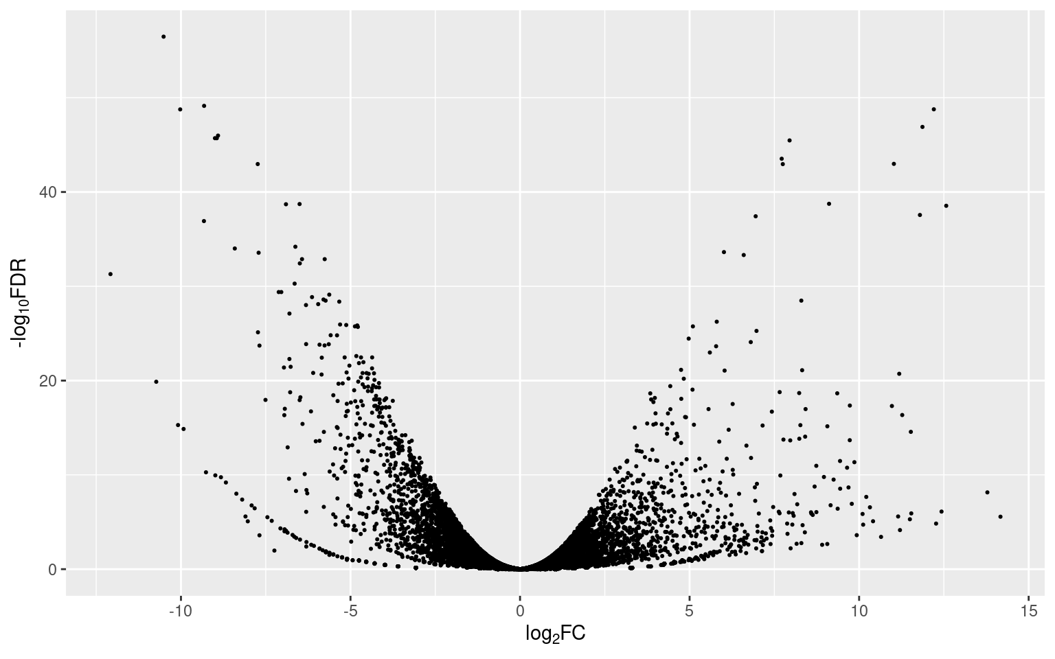
The dispersion of the points (representing genes) in the plot is similar to, you guessed, a volcano (that’s why they’re called volcano plots). Since the FDR values were transformed to their -log10, the higher the position of a point, the more significant its value is (y axis). Points with positive fold change values (to the right) are up-regulated and points with negative fold change values (to the left) are down-regulated (x axis).
Adding color to differentially expressed genes (DEGs)
Differentially expressed genes (DEGs) are usally considered as those with an absolute fold change greater or equal to 2 and a FDR value of 0.05 or less. So, we can make our volcano plot a bit more informative if we add some color to the DEGs in the plot. To do so, we’ll add an additional column, named ‘Expression’, indicating whether the expression of a gene is up-regulated, down-regulated, or unchanged:
data <- data %>%
  mutate(
    Expression = case_when(logFC >= log(2) & FDR <= 0.05 ~ "Up-regulated",
                           logFC <= -log(2) & FDR <= 0.05 ~ "Down-regulated",
                           TRUE ~ "Unchanged")
    )
head(data) %>%
  knitr_table()
| Genes | logFC | PValue | FDR | Expression |
|---|---|---|---|---|
| 276_4 | -10.511825 | 1.597352e-61 | 3.345653e-57 | Down-regulated |
| 62_157 | -9.317522 | 6.982557e-54 | 7.312483e-50 | Down-regulated |
| 144_7 | 12.203291 | 2.423896e-53 | 1.692283e-49 | Up-regulated |
| 198_6 | -10.022519 | 3.310041e-53 | 1.733220e-49 | Down-regulated |
| 829_3 | 11.867788 | 2.981901e-51 | 1.249119e-47 | Up-regulated |
| 44_124 | -8.906832 | 2.981555e-50 | 1.040811e-46 | Down-regulated |
We can now map the column ´Expression’ to the color aesthetic of geom_point() and color the points according to their expression classification:
p2 <- ggplot(data, aes(logFC, -log(FDR,10))) +
  geom_point(aes(color = Expression), size = 2/5) +
  xlab(expression("log"[2]*"FC")) +
  ylab(expression("-log"[10]*"FDR")) +
  scale_color_manual(values = c("dodgerblue3", "gray50", "firebrick3")) +
  guides(colour = guide_legend(override.aes = list(size=1.5)))
p2
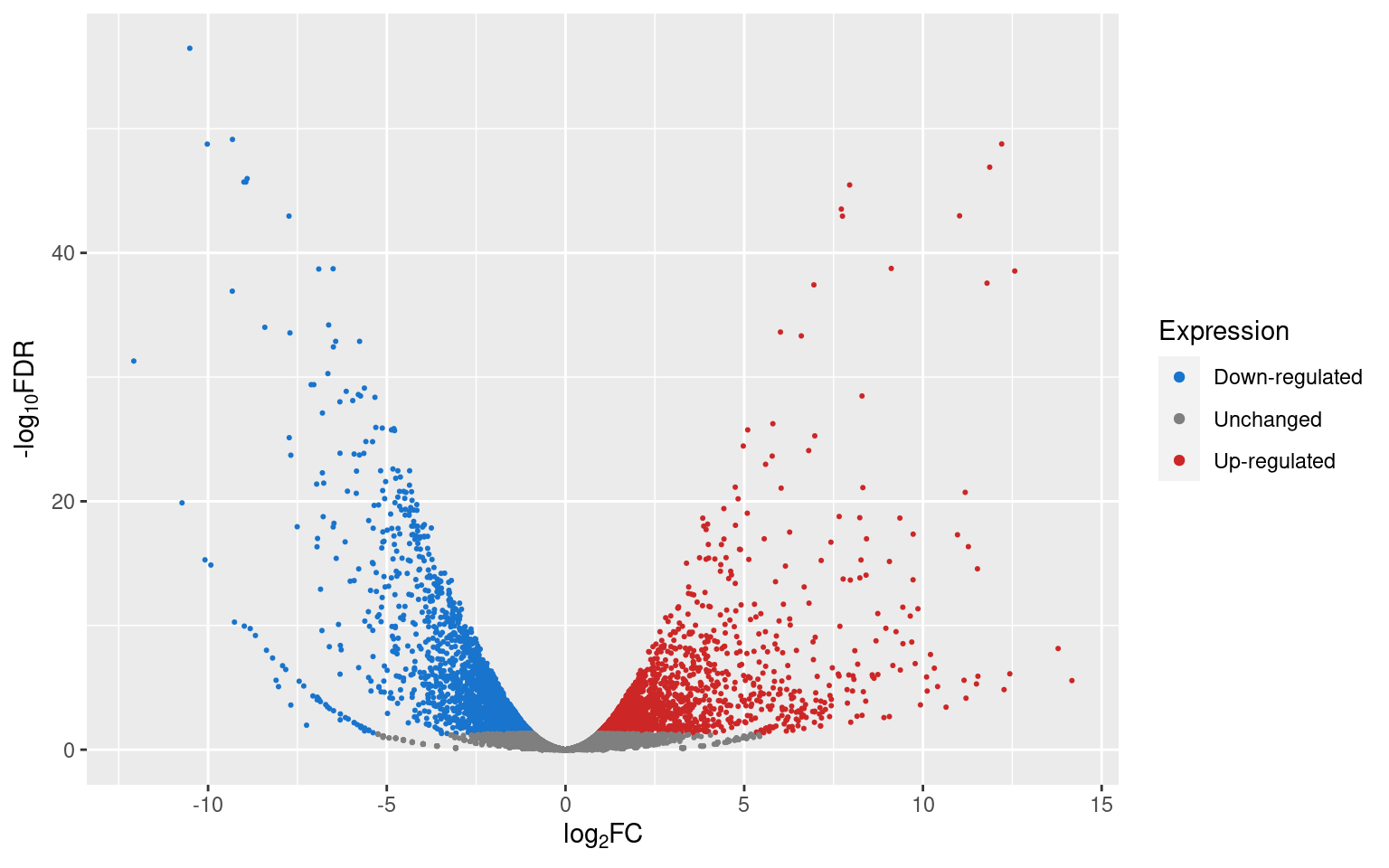
If we want to know how many genes are up- or down-regulated, or unchanged, we can use dplyr’s count() function.
data %>%
  count(Expression) %>%
  knitr_table()
| Expression | n |
|---|---|
| Down-regulated | 2,559 |
| Unchanged | 16,317 |
| Up-regulated | 2,069 |
Since we already know that the genes towards the right are up-regulated and the genes towards the left are down-regulated, it would be more informative if we colored the points according to their significance level instead. Let’s create another column, named ‘Significance’, and classify the genes according to significance thresholds (0.05, 0.01, and 0.001):
data <- data %>%
  mutate(
    Significance = case_when(
      abs(logFC) >= log(2) & FDR <= 0.05 & FDR > 0.01 ~ "FDR 0.05",
      abs(logFC) >= log(2) & FDR <= 0.01 & FDR > 0.001 ~ "FDR 0.01",
      abs(logFC) >= log(2) & FDR <= 0.001 ~ "FDR 0.001",
      TRUE ~ "Unchanged")
  )
head(data) %>%
  knitr_table()
| Genes | logFC | PValue | FDR | Expression | Significance |
|---|---|---|---|---|---|
| 276_4 | -10.511825 | 1.597352e-61 | 3.345653e-57 | Down-regulated | FDR 0.001 |
| 62_157 | -9.317522 | 6.982557e-54 | 7.312483e-50 | Down-regulated | FDR 0.001 |
| 144_7 | 12.203291 | 2.423896e-53 | 1.692283e-49 | Up-regulated | FDR 0.001 |
| 198_6 | -10.022519 | 3.310041e-53 | 1.733220e-49 | Down-regulated | FDR 0.001 |
| 829_3 | 11.867788 | 2.981901e-51 | 1.249119e-47 | Up-regulated | FDR 0.001 |
| 44_124 | -8.906832 | 2.981555e-50 | 1.040811e-46 | Down-regulated | FDR 0.001 |
Again, we can use the color aesthetic to map the color of the points to their corresponding significance thresholds:
p3 <- ggplot(data, aes(logFC, -log(FDR,10))) +
  geom_point(aes(color = Significance), size = 2/5) +
  xlab(expression("log"[2]*"FC")) +
  ylab(expression("-log"[10]*"FDR")) +
  scale_color_viridis_d() +
  guides(colour = guide_legend(override.aes = list(size=1.5)))

p3
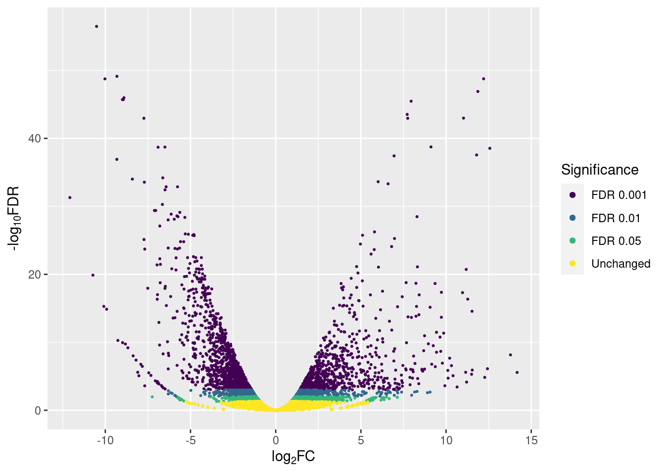
And we can count how many genes are up- or down-regulated according to the different significance thresholds with count():
data %>%
  count(Expression, Significance) %>%
  knitr_table()
| Expression | Significance | n |
|---|---|---|
| Down-regulated | FDR 0.001 | 1,259 |
| Down-regulated | FDR 0.01 | 584 |
| Down-regulated | FDR 0.05 | 716 |
| Unchanged | Unchanged | 16,317 |
| Up-regulated | FDR 0.001 | 799 |
| Up-regulated | FDR 0.01 | 484 |
| Up-regulated | FDR 0.05 | 786 |
Adding labels to selected genes
If we labeled all of the genes, we’d end up with a plot with overcrowded labels that wouldn’t be possible to read. So, we could opt for labelling only the top n genes or a specific subset of them. For example:
top <- 10
top_genes <- bind_rows(
  data %>%
    filter(Expression == 'Up-regulated') %>%
    arrange(FDR, desc(abs(logFC))) %>%
    head(top),
  data %>%
    filter(Expression == 'Down-regulated') %>%
    arrange(FDR, desc(abs(logFC))) %>%
    head(top)
)
top_genes %>%
  knitr_table()
| Genes | logFC | PValue | FDR | Expression | Significance |
|---|---|---|---|---|---|
| 144_7 | 12.203291 | 2.423896e-53 | 1.692283e-49 | Up-regulated | FDR 0.001 |
| 829_3 | 11.867788 | 2.981901e-51 | 1.249119e-47 | Up-regulated | FDR 0.001 |
| 127_41 | 7.949102 | 1.453754e-49 | 3.383209e-46 | Up-regulated | FDR 0.001 |
| 31_39 | 7.716666 | 1.415916e-47 | 2.965636e-44 | Up-regulated | FDR 0.001 |
| 146_68 | 11.025068 | 5.433919e-47 | 1.034668e-43 | Up-regulated | FDR 0.001 |
| 1078_1 | 7.749041 | 6.828288e-47 | 1.100142e-43 | Up-regulated | FDR 0.001 |
| 836_2 | 9.113524 | 1.191834e-42 | 1.783070e-39 | Up-regulated | FDR 0.001 |
| 5_110 | 12.568871 | 2.343958e-42 | 2.887894e-39 | Up-regulated | FDR 0.001 |
| 1092_3 | 11.793138 | 2.344945e-41 | 2.728604e-38 | Up-regulated | FDR 0.001 |
| 81_91 | 6.948956 | 3.398732e-41 | 3.746655e-38 | Up-regulated | FDR 0.001 |
| 276_4 | -10.511825 | 1.597352e-61 | 3.345653e-57 | Down-regulated | FDR 0.001 |
| 62_157 | -9.317522 | 6.982557e-54 | 7.312483e-50 | Down-regulated | FDR 0.001 |
| 198_6 | -10.022519 | 3.310041e-53 | 1.733220e-49 | Down-regulated | FDR 0.001 |
| 44_124 | -8.906832 | 2.981555e-50 | 1.040811e-46 | Down-regulated | FDR 0.001 |
| 25_31 | -8.997426 | 6.545320e-50 | 1.958453e-46 | Down-regulated | FDR 0.001 |
| 12_195 | -8.943343 | 7.513410e-50 | 1.967105e-46 | Down-regulated | FDR 0.001 |
| 85_19 | -7.735937 | 6.215242e-47 | 1.084819e-43 | Down-regulated | FDR 0.001 |
| 57_45 | -6.501718 | 1.355336e-42 | 1.892500e-39 | Down-regulated | FDR 0.001 |
| 170_33 | -6.903067 | 1.518887e-42 | 1.988317e-39 | Down-regulated | FDR 0.001 |
| 468_3 | -9.322243 | 1.156078e-40 | 1.210703e-37 | Down-regulated | FDR 0.001 |
p3 <-  p3 +
  geom_label_repel(data = top_genes,
                   mapping = aes(logFC, -log(FDR,10), label = Genes),
                   size = 2)
p3
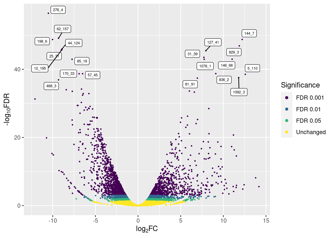
So, only the top 10 up- and down-regulated genes are labeled, avoiding overcrowding.
Conclusion
In this post we applied two different color schemes on a volcano plot and labeled a few genes using tools from the tidyverse.
Session info
info <- sessionInfo()
toLatex(info, locale = FALSE)
## \begin{itemize}\raggedright
##   \item R version 4.0.3 (2020-10-10), \verb|x86_64-pc-linux-gnu|
##   \item Running under: \verb|Ubuntu 20.04.1 LTS|
##   \item Matrix products: default
##   \item BLAS:   \verb|/usr/lib/x86_64-linux-gnu/blas/libblas.so.3.9.0|
##   \item LAPACK: \verb|/usr/lib/x86_64-linux-gnu/lapack/liblapack.so.3.9.0|
##   \item Base packages: base, datasets, graphics, grDevices, methods,
##     stats, utils
##   \item Other packages: dplyr~1.0.2, forcats~0.5.0, ggplot2~3.3.2,
##     ggrepel~0.8.2, purrr~0.3.4, readr~1.3.1, stringr~1.4.0,
##     tibble~3.0.3, tidyr~1.1.2, tidyverse~1.3.0
##   \item Loaded via a namespace (and not attached): assertthat~0.2.1,
##     backports~1.1.9, blob~1.2.1, blogdown~0.20, bookdown~0.20,
##     broom~0.7.0, cellranger~1.1.0, cli~2.0.2, colorspace~1.4-1,
##     compiler~4.0.3, crayon~1.3.4, curl~4.3, DBI~1.1.0, dbplyr~1.4.4,
##     digest~0.6.25, ellipsis~0.3.1, evaluate~0.14, fansi~0.4.1,
##     farver~2.0.3, fs~1.5.0, generics~0.0.2, glue~1.4.2, grid~4.0.3,
##     gtable~0.3.0, haven~2.3.1, highr~0.8, hms~0.5.3, htmltools~0.5.0,
##     httr~1.4.2, jsonlite~1.7.1, kableExtra~1.2.1, knitr~1.29,
##     labeling~0.3, lifecycle~0.2.0, lubridate~1.7.9, magrittr~1.5,
##     modelr~0.1.8, munsell~0.5.0, pillar~1.4.6, pkgconfig~2.0.3,
##     R6~2.4.1, Rcpp~1.0.5, readxl~1.3.1, reprex~0.3.0, rlang~0.4.7,
##     rmarkdown~2.3, rstudioapi~0.11, rvest~0.3.6, scales~1.1.1,
##     stringi~1.4.6, tidyselect~1.1.0, tools~4.0.3, vctrs~0.3.4,
##     viridisLite~0.3.0, webshot~0.5.2, withr~2.2.0, xfun~0.16,
##     xml2~1.3.2, yaml~2.2.1
## \end{itemize}